If you’ve been following the official Isabel Rose Facebook page, you likely weighed in on my Trouble in Paradise album cover design poll on Monday, put together by my fabulous designer Christina D’Angelo. Over 700 fans responded, and the results are in!
Just to jog your memory, here were the choices.
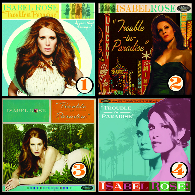
Album cover design #4 won by a landslide with 348 votes! In second place was #3 (one of my personal favorites!), with 162 votes.
A lot of you noted that some elements of these covers were borrowed from ’60s nostalgia and some of Christina’s and my favorite artwork. But as Jean-Luc Godard said, “It’s not where you take things from — it’s where you take them to.”
As a reward for all your thoughtful comments, I figured it would be fun for Christina to share some personal thoughts about the evolution of each of the designs and what inspired them. (You may also notice some special enhancements to your favorites!)
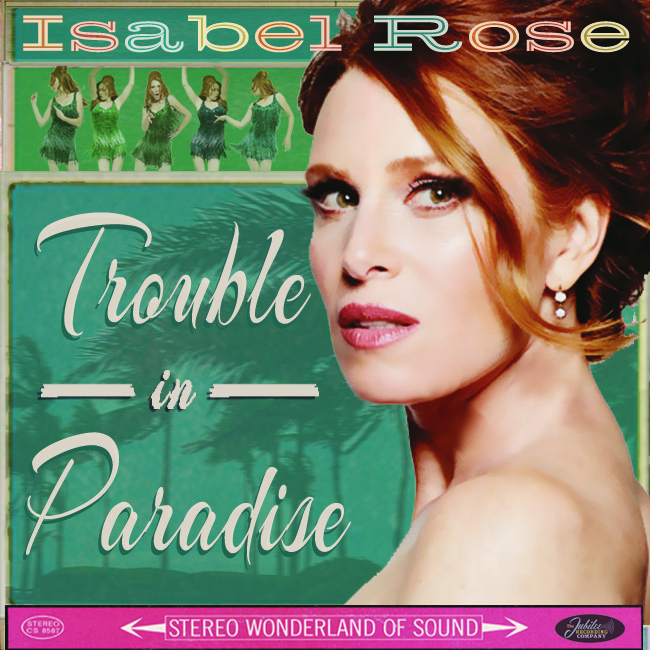
#1
“On the set of the shoot (click to see the behind the scenes) with photographer Derek Kettela, when we saw this photo being taken, we all screamed, ‘This is the cover!’ Everything about this shot is so Ursula Andress, and that dress by Allexandre Vauthier is just incredible. And how about those dancing girls? They’re from a previous shoot with rock n’ roll photographer Mick Rock. The font comes from designer Herbert Matter’s original logo for the New Haven train line — we’re wild about that font.”
#2
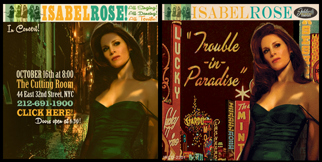
“The elements of this design were taken from a poster I made for Isabel’s show at The Cutting Room and Isabel’s love of pulp fiction book jackets. We thought it would work especially well as an album cover if we threw her into a pastiche of Las Vegas signs. I created the ‘old record logo’ on the top right for this image.”
#3
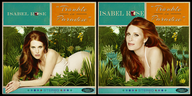
“For #3, Isabel and I asked ourselves, what says ‘Trouble in Paradise’ more than Adam and Eve’s Eden? So, I ripped apart a Henri Rousseau painting and placed her within it, then added a little cheekiness by including a half-bitten apple to replace the ‘O’ in her name. Then, I decided to try another version with even stronger garden imagery. I chose a different photo from Derek Kettela’s shoot and threw in a few more lilies to balance the bright turquoise at the top. I still think with a few more tweaks, this one could be even better!”
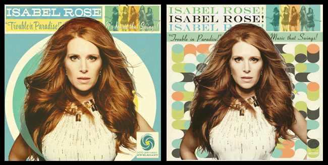
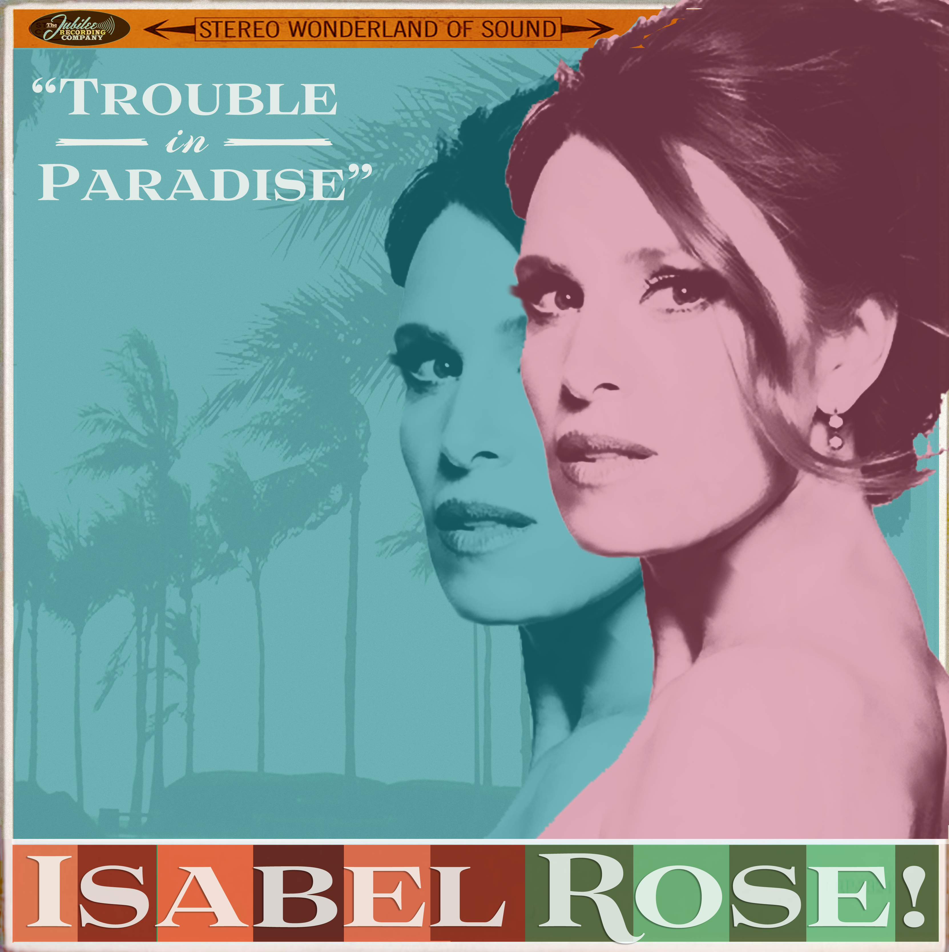
#4
“This one started off as the design above. But while everyone really liked it as is, some said it was a little too Ginger Grant. So, I decided to take a complete departure from what I normally design for Isabel and make something I would love. I started thinking about my favorite movie posters for films from two of my favorite directors, Ingmar Bergman and Pedro Almodovar. The poster for Bergman’s Persona and the stunning blue and red poster for Almodovar’s Talk to Her (inspired by Barbra Streisand’s Duets album cover) popped into my mind.”
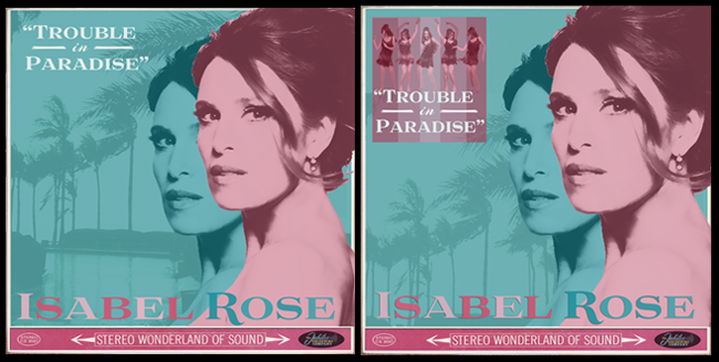
“To my surprise, Isabel, management and everyone who saw it flipped over the final result! But we agreed it needed to be a bit more ‘fun,’ so we once again pulled in Mick Rock’s dancing girls, which may still come back in the final version. Finally, I decided to add more flair with some color blocking. (Please note how, with this font, I had the ‘R’ in Rose dip below the baseline ever-so seductively! Simple elements like this knock me out.)”
Christina concluded, “I feel we’re almost there with cover but there’s more to come: don’t forget the back cover and the inside artwork! There’s more to come!”
Christina’s concepts above are just in their beginning phases, so stay tuned as they develop. Keep your eyes on my blog, The Rose Note and my Facebook page for more chances to weigh in on album art, videos, music and more as the release date of Trouble in Paradise approaches!
Is your favorite winning so far? Tell me in the blog comments section below!
xo,
Isabel
I really loved the green dress and also #3 I could not decide, sorry—GUY
I didn’t vote, but I like #4 the best out of the finals. The poster for the Cutting Room Floor concert would have made the best cover before it got the Vegas treatment. It has a great Film Noir vibe, and looks closer to those sultry, femme fatale album covers of the 60s.
You look ravishing in all of them, but #3 is my favorite. Makes me wish I was Adam!!
I actually loved them ALL… but I voted for #4. Any of them would be great. You look beautiful on every cover and the artwork is outstanding. Can’t wait to hear the album! 🙂
1 & 3 are close. Throw back to a song in the 50’s. Need more James Dean Everly Bros Tommy Roe energy and looks (Shangri-Las Lavern Baker)