Coming up with the perfect retro logo design is harder than it looks!
I thought I’d walk you through the steps my designer and I took to create my own new logo.
Step 1 – What do we want to convey?
- I’m a singer
- My music and look hearkens back to the Vegas 60s (as opposed to the psychedelic 60s)
- The brand does a lot of winking– in other words, I don’t take myself too seriously!
- I’m the girl next door who happens to become a vixen once the music starts (think Ann-Margret in Viva Las Vegas)
Step 2 – Look for inspiration
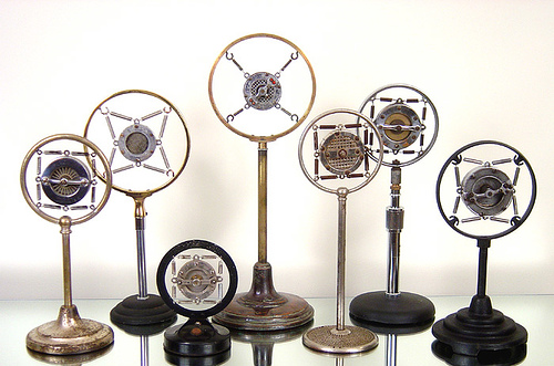
My designer, CHRISTINA D’ANGELO, began by studying images of vintage microphones.
Step 3 – Start somewhere, anywhere…
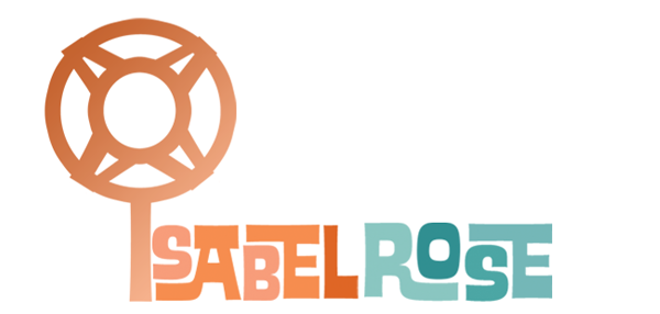
Design #1
I thought this was the cat’s meow and sent it off to my manager for confirmation, but he wrote back: “What’s that thing above the letter I? A wind machine? A searchlight? A lollipop?”
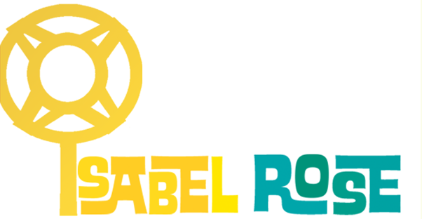
The microphones Christina had used as inspiration were from the 1930’s, so we experimented with a change of color, hoping the logo would read more ‘60s, but the microphone REALLY looked like a searchlight once we made it yellow.
Step 4 Refine and adjust
Design#2
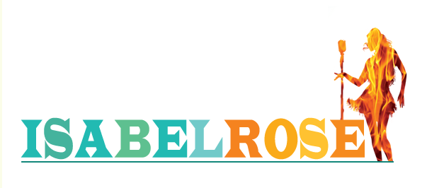
With this design, Christina attempted to incorporate a more 60s looking microphone and to indicate a sense of fun and Vegas.
Oh, how I loved this design and it’s James Bond-ish girl on fire!
But doubt set in quickly when we shrunk it down in size. While it was perfect for a postcard, the image definitely lost something in translation when it was minimized.
Design #3
“Classy,” I thought, but I knew something was missing.
I let it sit on my desk for a few weeks. Finally, it dawned on me: it was missing energy; it was missing fun. And it definitely didn’t indicate anything Vegas-y or 60s.
We tried to add pizzaz by altering the color…
…and by trying a design feature that we thought might approximate sound waves…
But we knew we still weren’t there.
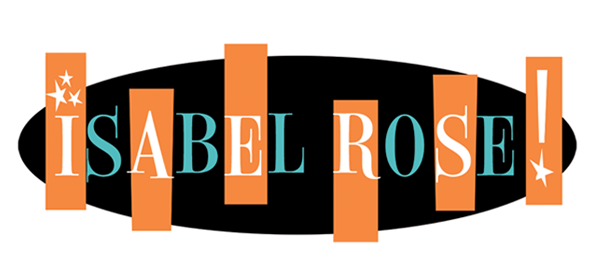
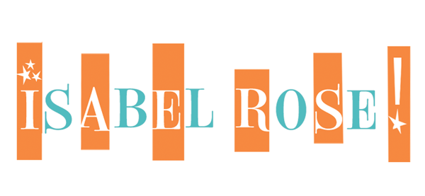
Finally, Christina found just the inspiration she needed with a mid-century up-and-down Roman font she used on my cyber concert graphics. Et viola! My logo was born.
Design #4
This has it all!! I knew it was perfect because we could do some many things with it.
So? What do YOU think? Have YOU ever created a logo? It ain’t easy now, is it??



TA-DAAAA!!! Yes… learning… ALL the time. Heck I just learned a couple things too!
So… do you like it?
Love it! It is SOOOO you, Isabel! 🙂
Glad you like it!