The title for my upcoming album has been chosen! Trouble In Paradise has won, beating out Start of Something Big and plain old Isabel Rose by a narrow margin.
Now comes the fun part: designing the album cover art.
Trouble In Paradise could go a lot of different ways: it could refer to Adam and Eve and their expulsion from Paradise; it could refer to a night club called, say, “Paradise,” and the album cover could suggest the troubles of a singer in said lounge. I could be causing the trouble; I could be in trouble…
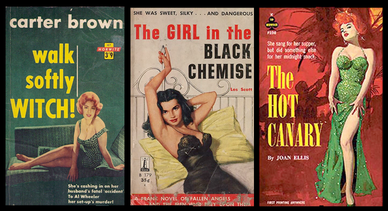
Artwork can always go in a million different directions. But it has to start somewhere, and that somewhere, for this album anyway, are the pulp fiction book jackets of the ’60s.
I’ve always been drawn to the kitschy-ness of these dime store anti-tomes. Can’t you see Trouble In Paradise as the title on the cover of one of those book jackets?
Of course, once I began looking into the styles of the ’60s, I found myself compelled to learn about where that style began.
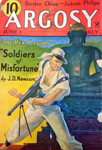
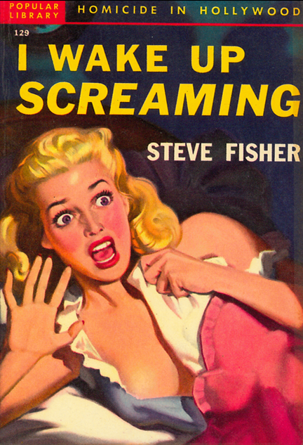
The term “pulp fiction” originally referred to “pulp” paper magazines of the late 19th century which were printed on paper made directly from wood-pulp. This type of paper rapidly yellowed so it didn’t lend itself to photographs. The illustrations were painted or drawn instead, hence the colors and style of which I am so fond.
You have to keep in mind that back in the 1890s, when pulp fiction began, there wasn’t any TV or even radio yet. Pulp magazines delivered action, romance, mystery and heroes to exhausted workers, bored housewives and everyone in between.
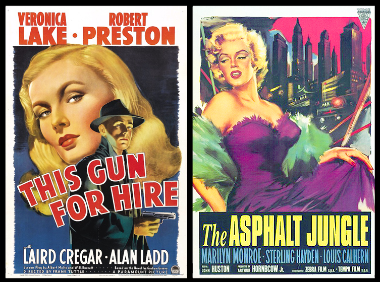
Once movies came along, they borrowed heavily from the popular story lines of pulp magazines.
I love the rich color palettes and the dramas portrayed in these posters. They’re so eye-catching and evocative, they truly make me want to know more.
Once the genre caught on, whole magazines devoted themselves to these fictionalized dramas, written by some of the best authors of the time (and still in print!).
Here are two of my favorite pulp-inspired movie posters featuring none other than Veronica Lake and Miss Marilyn Monroe.
I asked my very own graphic design genius, Christina D’Angelo, to mock something up for me in the style we’ve all become expert on together since you’ve gotten this far in my post!
So… what do you think? Should I stick with this style, or explore something else entirely? Let me hear from you.
xo,
Isabel

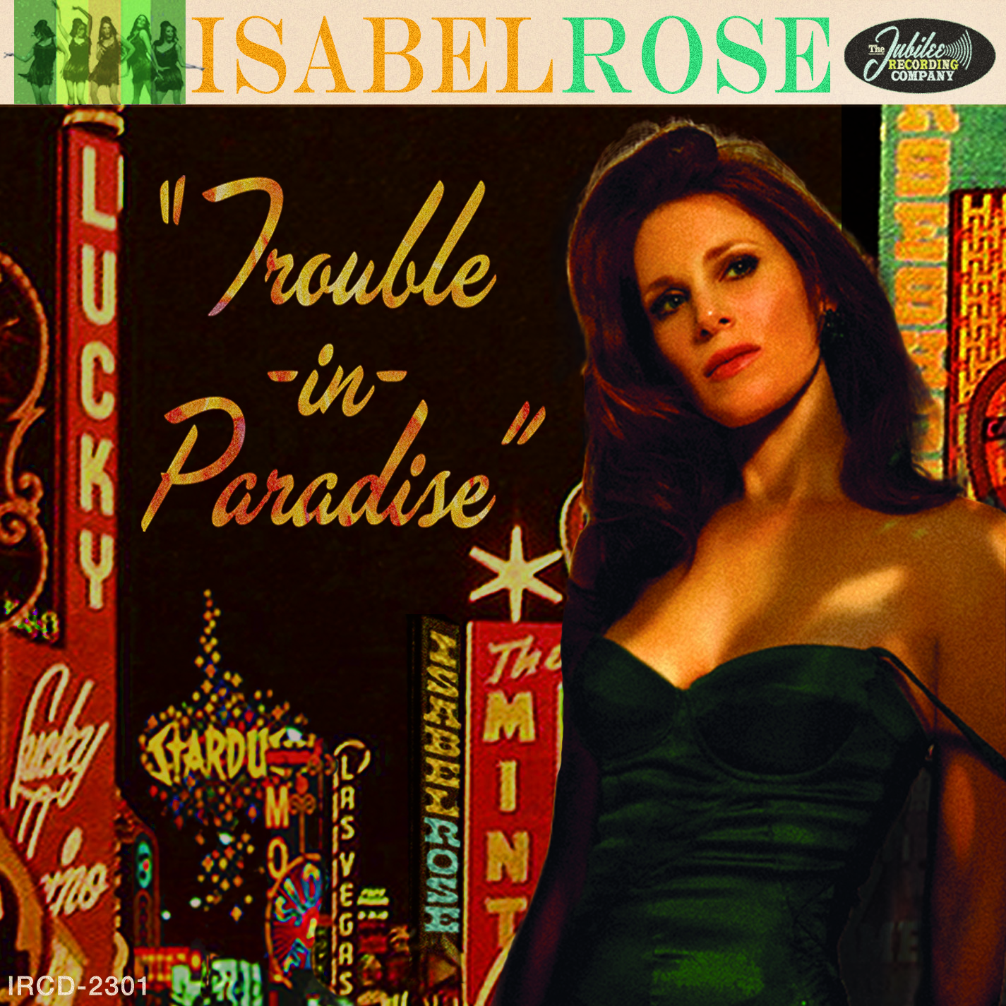
Love the Trouble mock up. White band with your name, mini-photos and record co. logo is very Old School Capitol records. Only item that needs tweaking is the font/effect for the album title. Photo is smoldering!
Thanks! I totally agree. That font is a placeholder as we couldn’t come to an agreement.
So glad you dig it!
xo
Good response, Joe — the font I used as the title is a sans serif that became the godfather of many modern fonts from the late 1950s and 1960s (including Helvetica), however, I did try several other different fonts and effects that were also of the period and a bit more exciting. I really love the latter one that Isabel just put up (after your thoughtful commmetary)– it’s the fiery script one — what do you think about that one?
Christina,
Like the ‘Fire’ motif very much. As much as ‘Pulp’ is the motive, for me, a little more glitz was in order. This is Isabel, after all! The Broadway/Vegas marquees are perfect – especially where you personalized them!
I’m so glad you noticed that little detail of how I put Isabel’s name in the marquee lights – as is should be, right? Thank you!
Someone beat me to the album title font. 🙂 “Paradise” can suggest a lot of things – a state of mind or euphoria, perhaps a false one along with your Eden and nightclub, an alcohol induced view or other seamy substance that alters a person’s outlook. The naughty aspect tantalizes enough to get people to look at your music or product a little longer at least. Maybe this is what’s meant by a hook but done your style which is kind of classy. I don’t understand why I’d never heard of you until Bruce G. recommended you on Facebook. You keep working hard and pushing and even more people will hear of you. … Me, I’m no one in particular; I’ve been writing for a long time but abandoned trying to publish anything long ago. Best of luck, Isabel!
I love this thoughtful response! Thank you so much. Check out my other-font option!