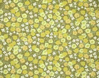
I’m still reeling. Merton invited me over to see his new kitchen wallpaper and I swear to God, he chose the exact wallpaper my grandmother had in her kitchen; the exact wallpaper my sisters and I swore we would tear off if we could, it was so hideous. We literally joked that it looked like the garden threw up on her walls.
“It’s the very definition of chic,” Merton said, nonplussed by my chagrin. “You, Isabel, of all people, should know that avocado was the it color of the ’60s.”
“Is that what people are calling puce these days?” I replied.
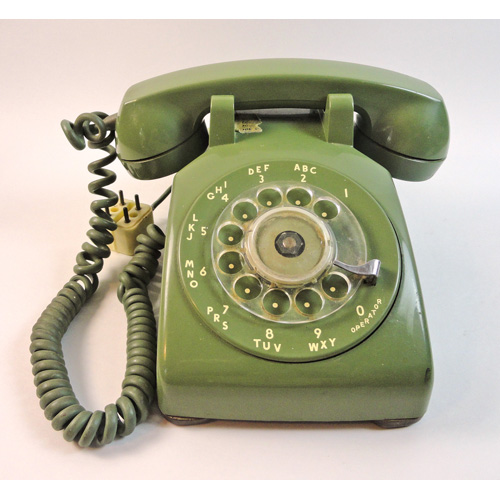
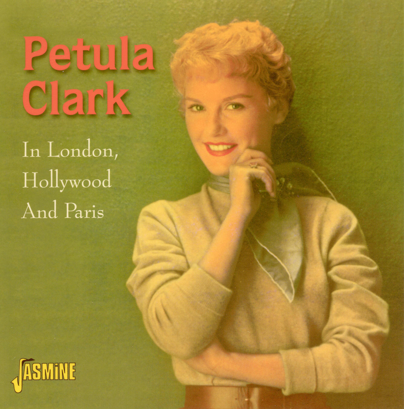
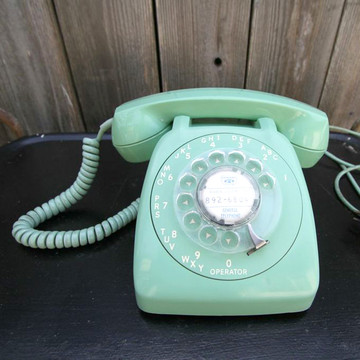
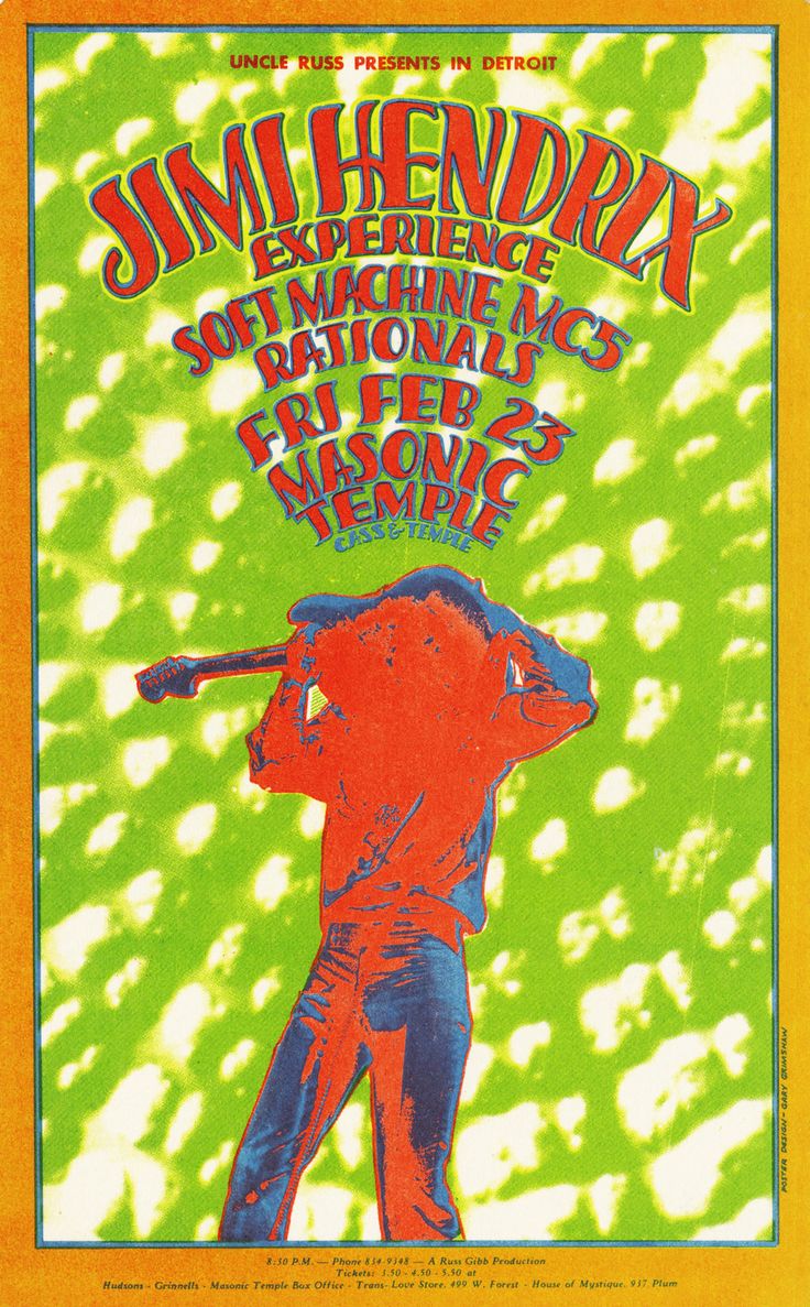
But I had to concede, he had a point. Puce green, avocado green, swamp green– call it what you will– we all know what green we’re talking about when we talk about that particular shade that was so ubiquitous in the designs of ’60s. From telephones to record albums, that green was everywhere!
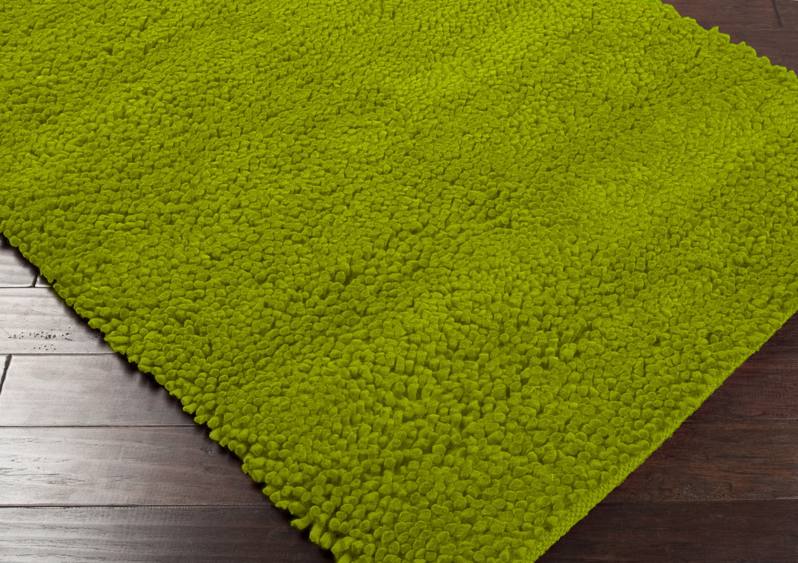
What was going on? Did the entire world just lose their collective mind for a decade and a half? I say “a half” because that shade was so beloved it practically became the American national color in the 70s, especially if you judge by the shag carpet my grandmother put throughout her entire Vernon, New Jersey two-story ranch house in 1974.
As soon as I got home from that shocking visit to Merton’s, I called my brilliant graphic designer friend, Cricket, and asked for her thoughts on the matter. Cricket is an expert on vintage color palettes and wrote her entire PhD dissertation on the healing powers of the color saffron, so I knew I could trust her analysis.
Cricket says that by 1964, with JFK 6 feet under and instability rising in Asia, the world was tired of the perky, mint green that virtually symbolized the ’50s.
Cricket explained that once Kennedy was assassinated, the country had “trust issues” which lead to a deep need for authenticity; that need for authenticity translated into an embrace of tones found throughout nature, which included shades like the avocado green in question.
“But it’s hideous!” I cried.
“Perhaps to you,” Cricket said, “but not to the masses of the ’60s and ’70s. After such massive betrayal— you have to remember, darling, all sorts of people were being assassinated back then! The masses wanted to see things that felt they could trust at face value. Look at the faces our culture embraced at that time.”
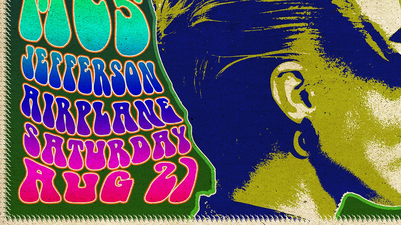
“You also have to remember that everyone was dropping acid back then, too,” Cricket reminded me. “So what you may call vomit green may have looked like emeralds from heaven to someone tripping.” She sent me a few psychedelic posters from the era and got on with her day.
Alone in my apartment, I sat with my hand on the phone in a deep funk. I totally get the whole, “beauty is in the eye of the beholder,” notion; and I also get that beauty is about unique characteristics— like the jolie laide gals shown above who will always have a place in the worlds’ eye. But isn’t there any consensus at all on what actually is ugly?
I would argue that there is! We all look back on fashions of past decades and rebuke ourselves for our obsessions.

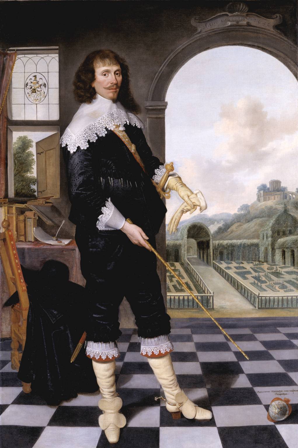

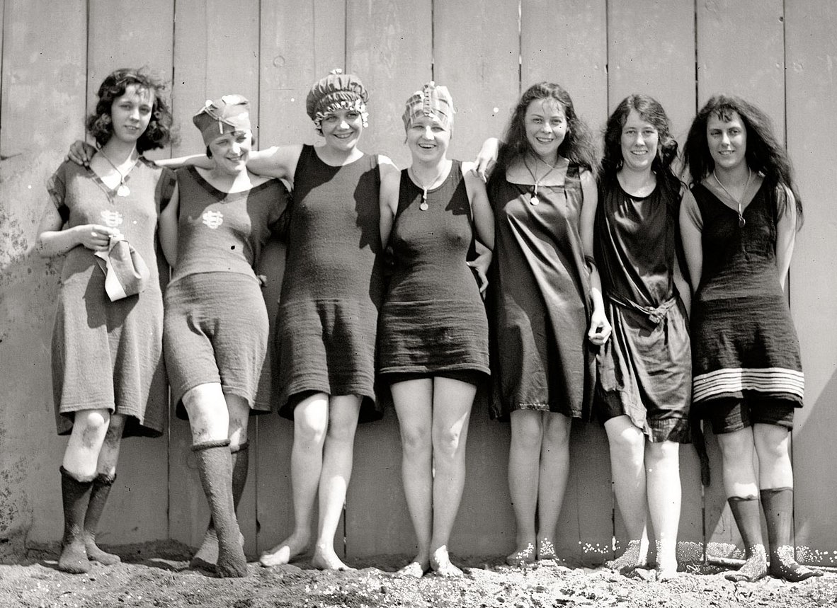
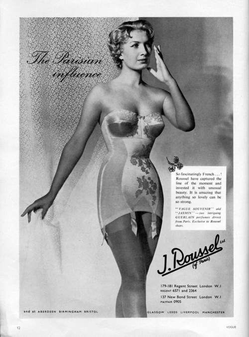

Clearly, fashion reflects our psychological need at the cultural moment. It evolves because we are constantly evolving.
Phew! I get it! So… Now that I have a new-found appreciation for avocado green, I have the perfect gift for Merton for the holidays! It was given to me by my grandmother and I’ve kept it in storage ever since.
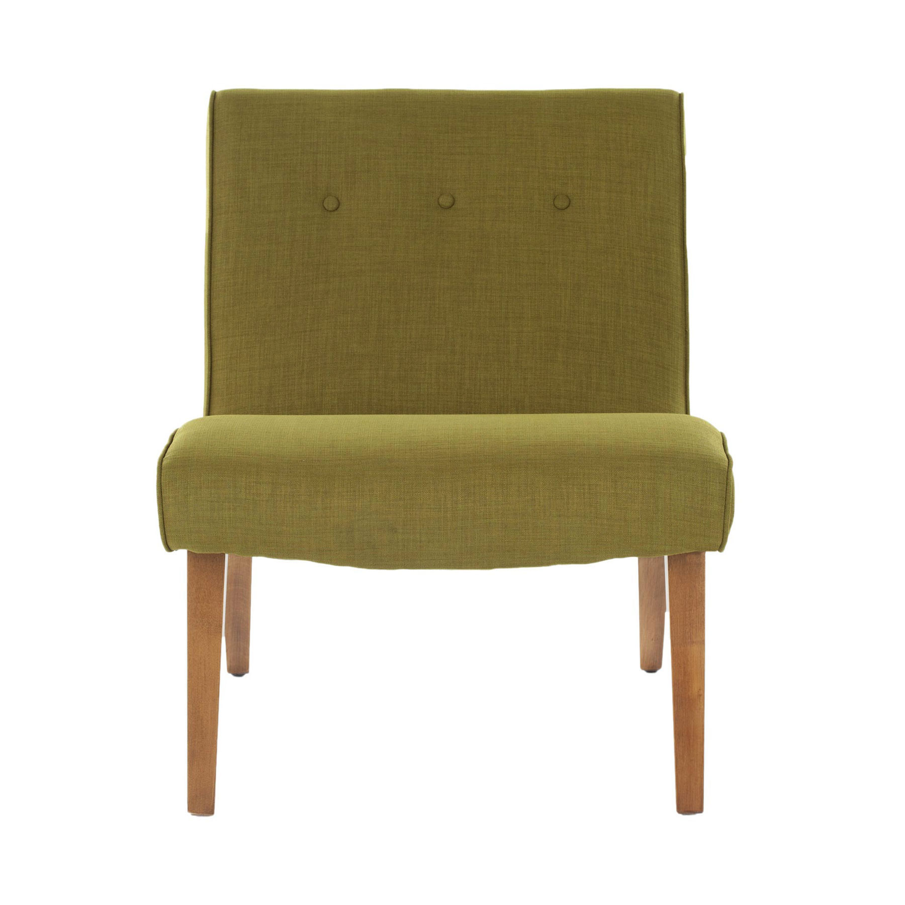
I hope Merton loves it in a way I simply can’t. Hopefully, he will sit there on his throne and pontificate about the next shade from the past will become chic again. Turquoise anyone?
xo,
Isabel




Green is a good color. Grass parks trees. A money color. One of the heart chakra colors.
My Grandmother described Puce as the color of a mouse’s fart!
Avocado & Yellow Ochre… the bongo beat color anthem of Sixties interior designers… practically radioactive!
Puce is nowhere near green, it’s actually a brownish purple.